FLORISTRY & EVENT DESIGN / 2025
Époque
An era of elegance.
Visual identity · Bilingual typography · Pattern design · Packaging & applications
An identity made for the occasion.
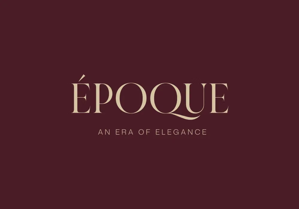
Époque brings a refined typographic signature to flowers, gifting, and event design. A restrained wordmark anchors a richer world of botanical linework, burgundy, blush, and warm neutral tones.
- DISCIPLINES
- Visual identity · Bilingual typography · Pattern design · Packaging & applications
- CREDITS
- Fettah — El Florentino · The Owl Studio
Elegance, in two scripts.
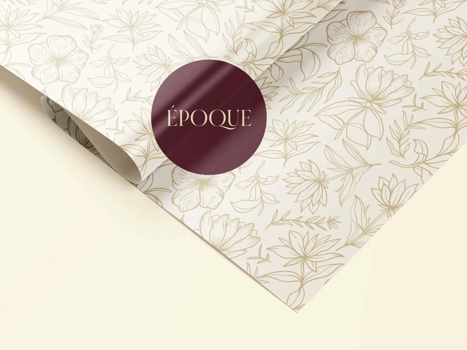
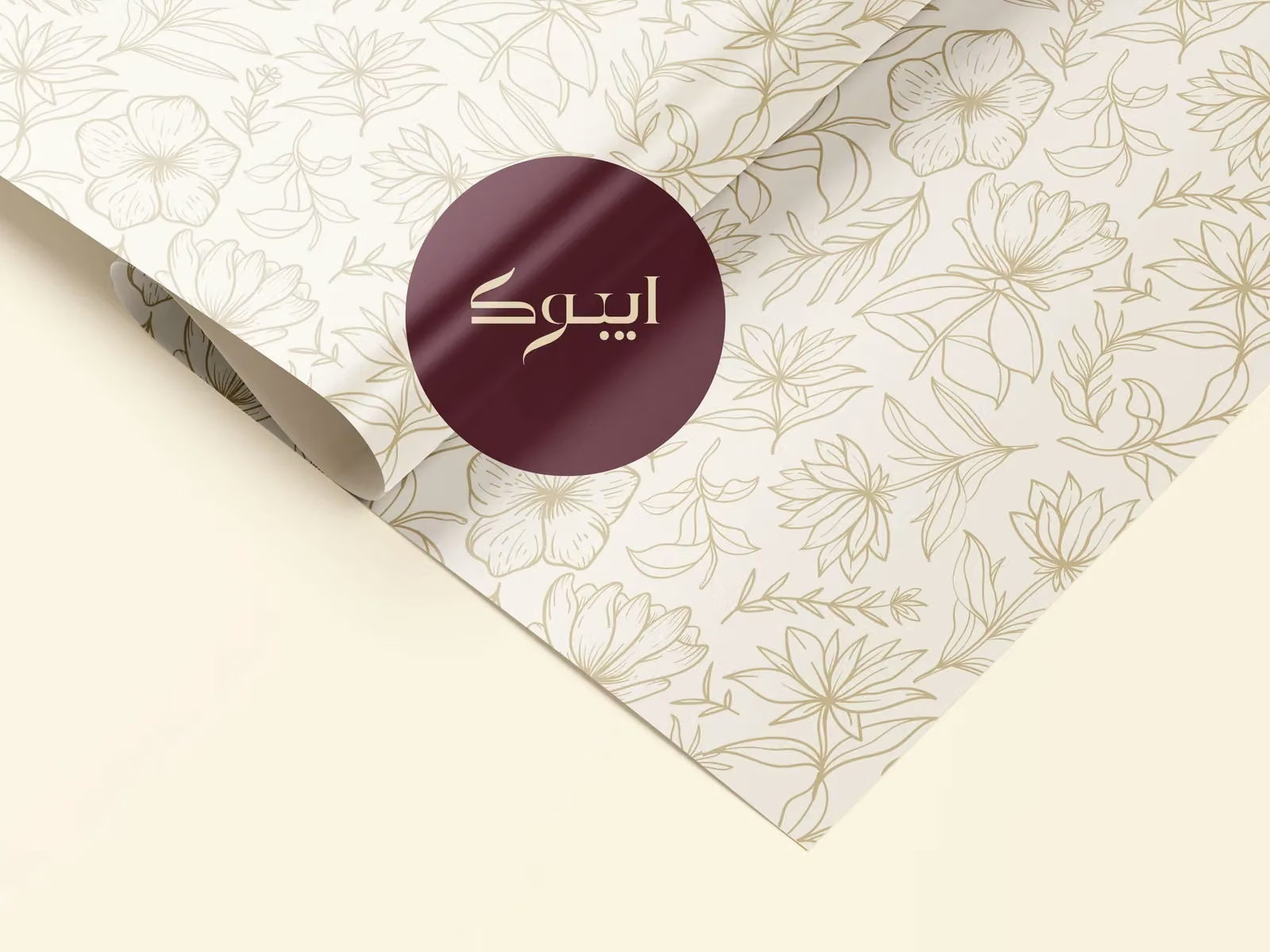
The Latin wordmark uses high-contrast serif forms and an expressive Q. Its Arabic counterpart shares the same flowing character, creating a bilingual identity with a consistent sense of refinement.
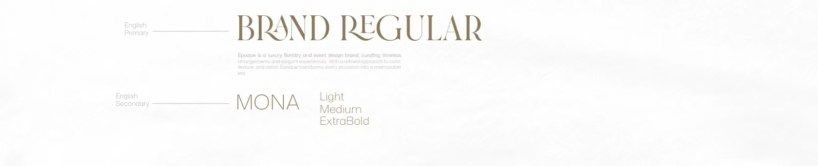
Typography & colour

A quieter kind of abundance.
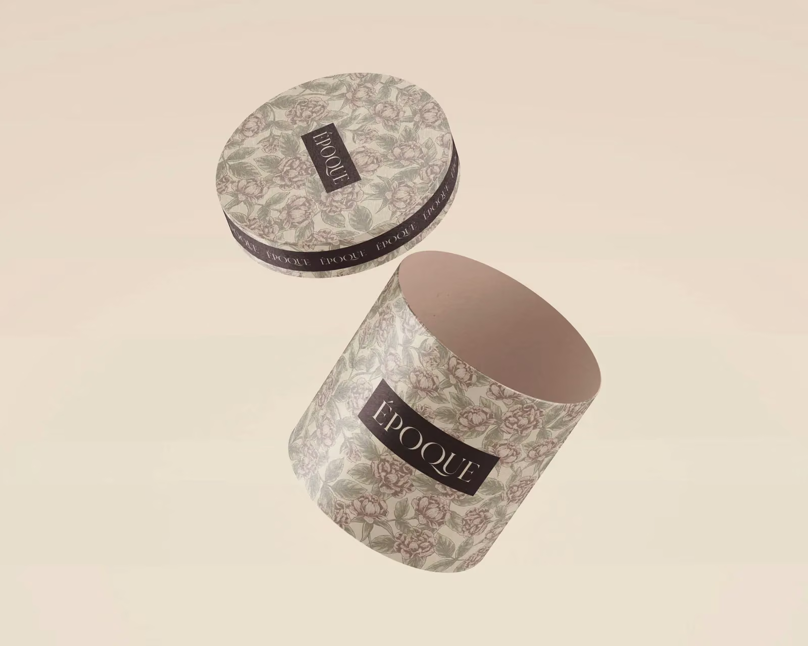
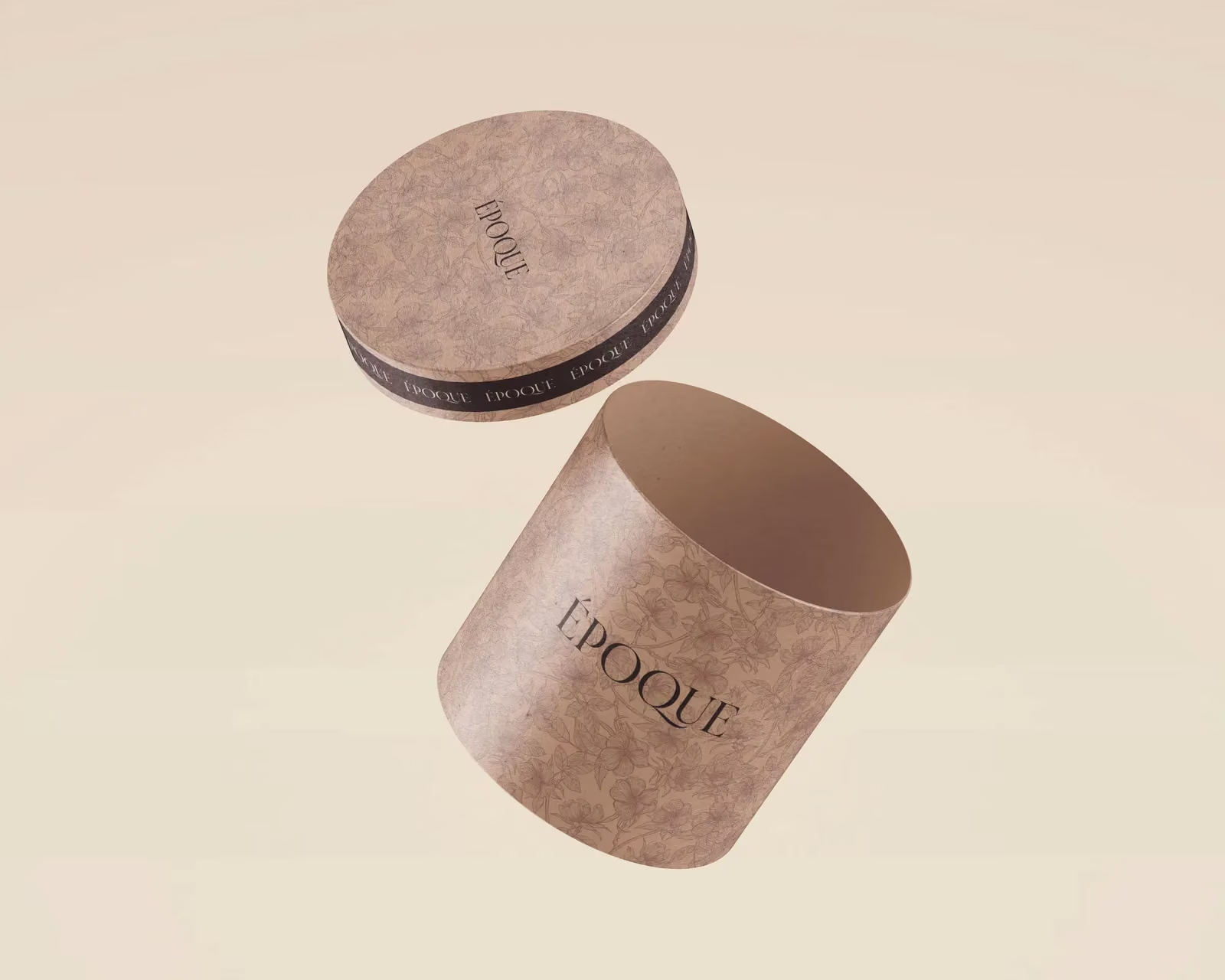
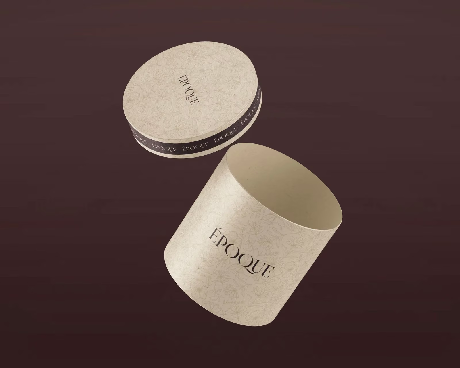
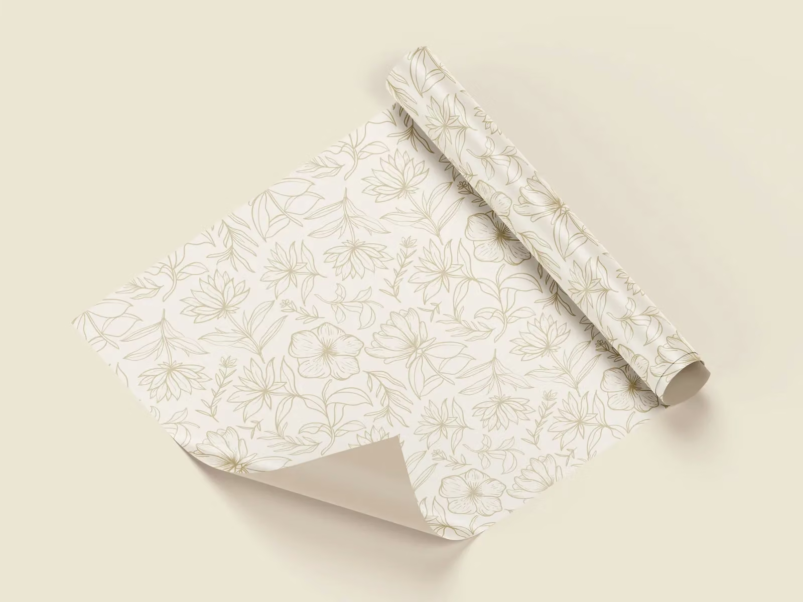
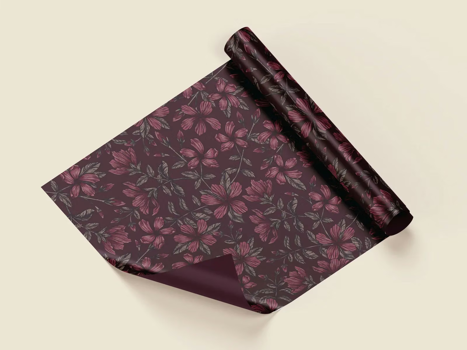
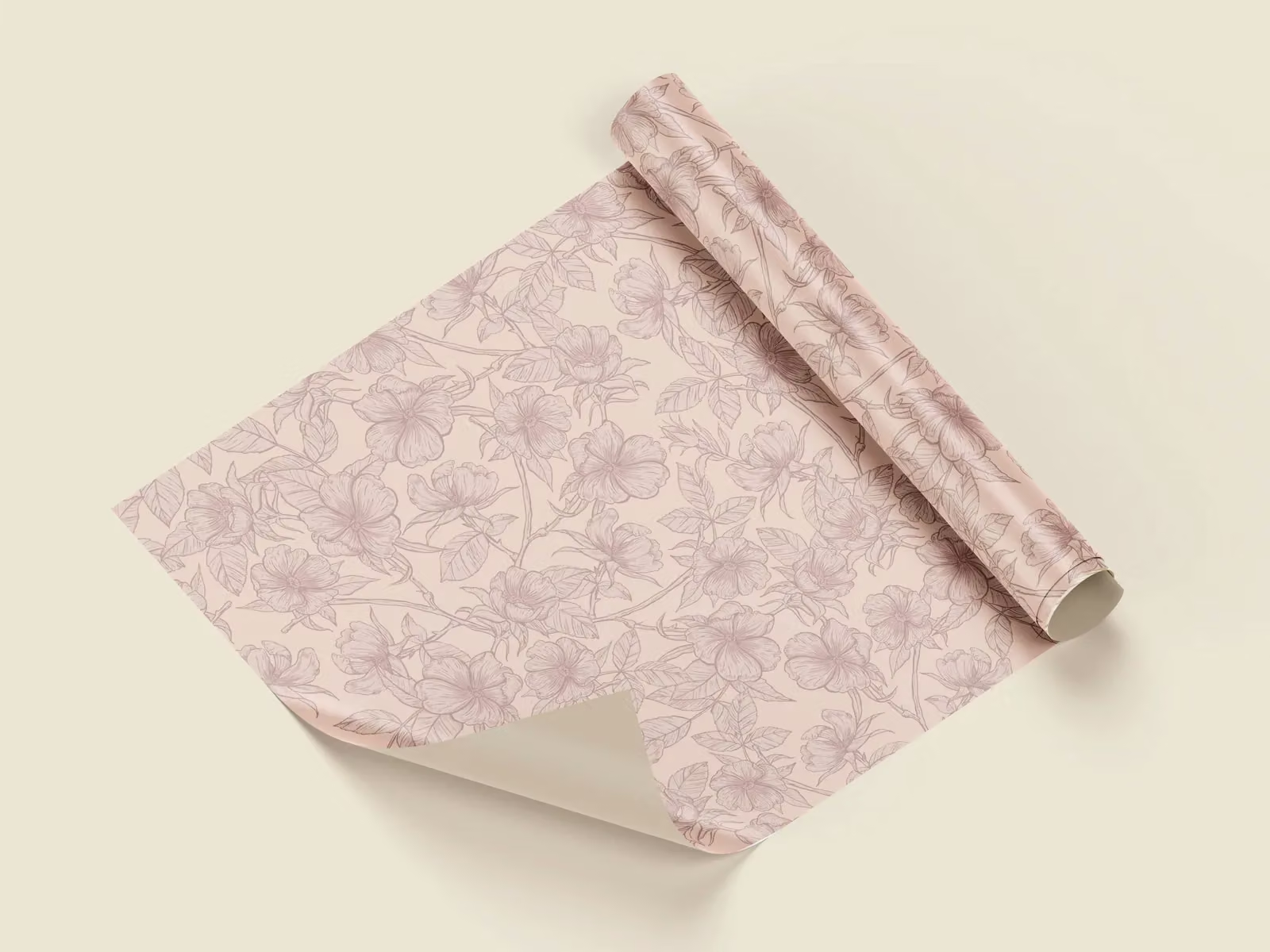
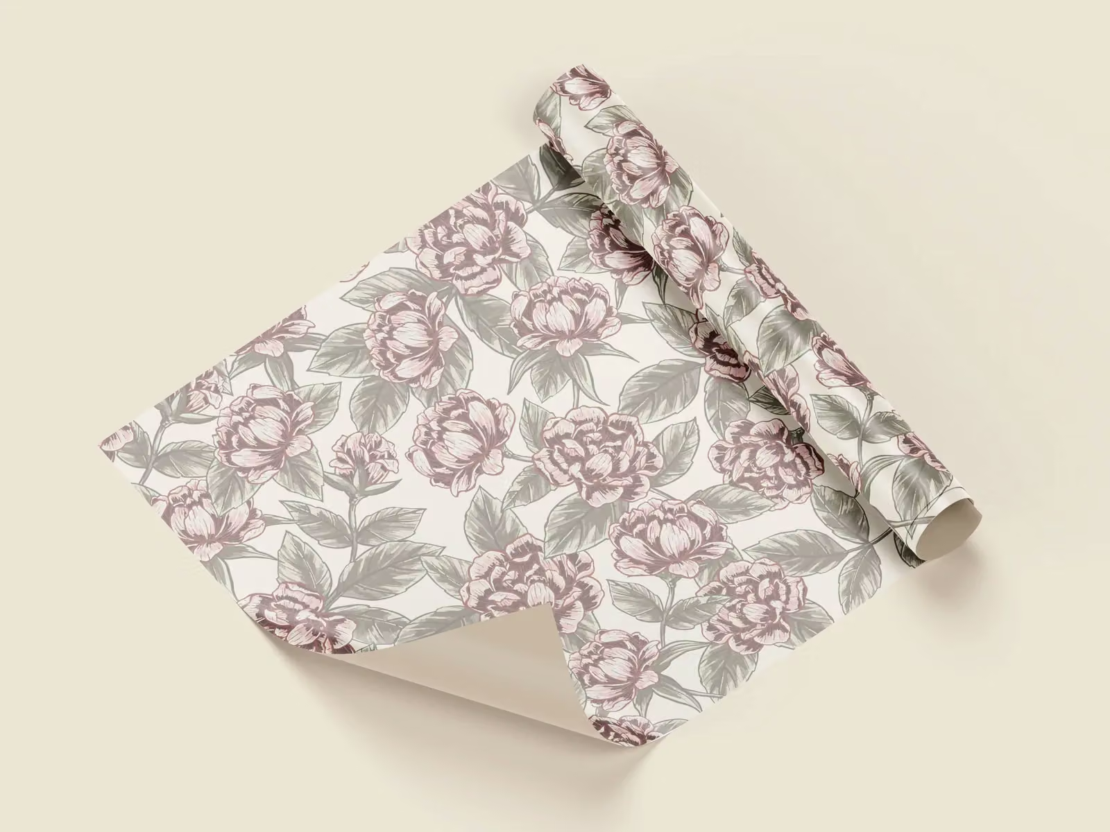
Four botanical treatments range from delicate linework to dense floral texture. Cream and blush keep the lighter applications soft; deep burgundy gives the darker compositions their depth.
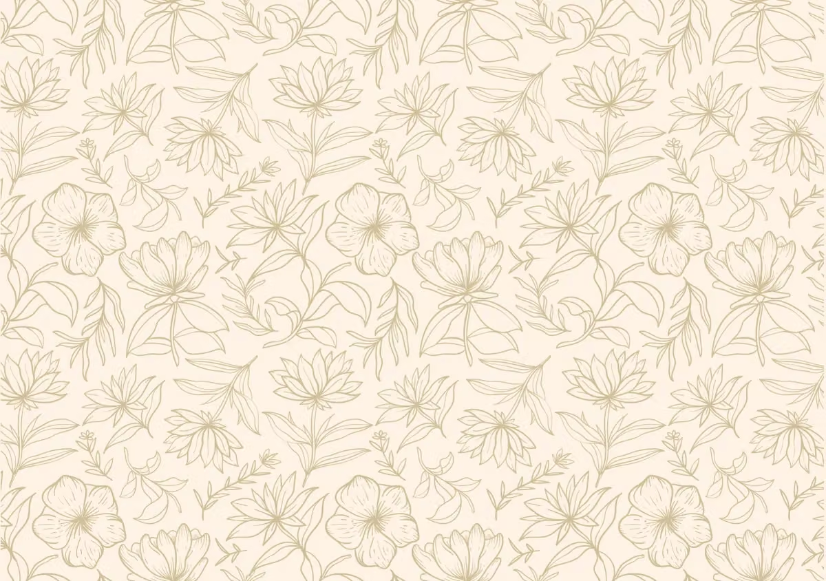
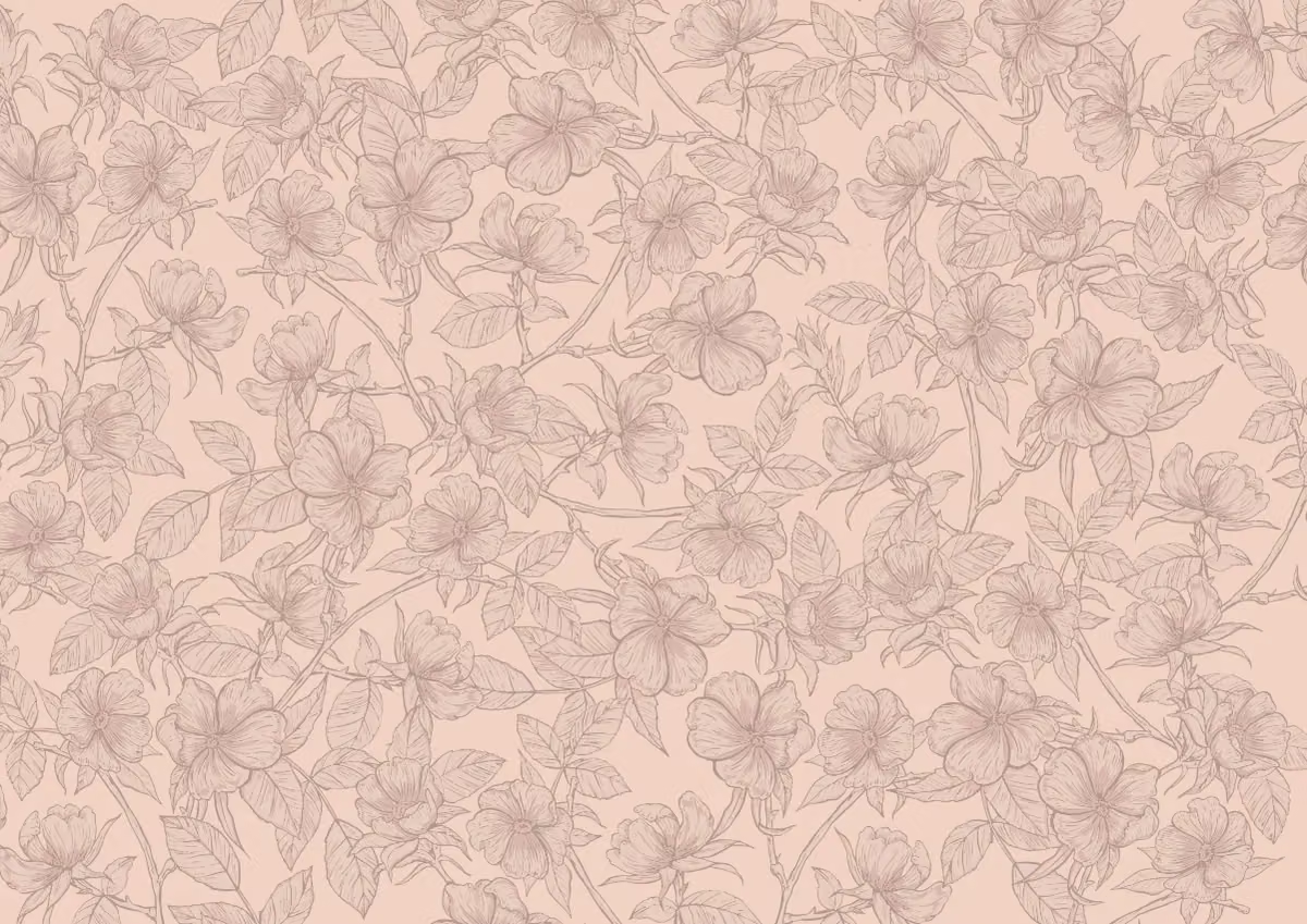
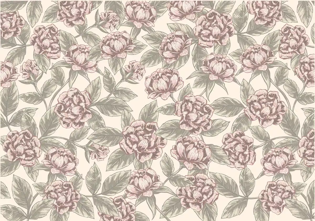
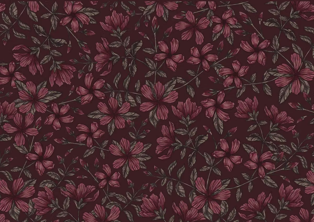
The gesture begins with the wrapping.
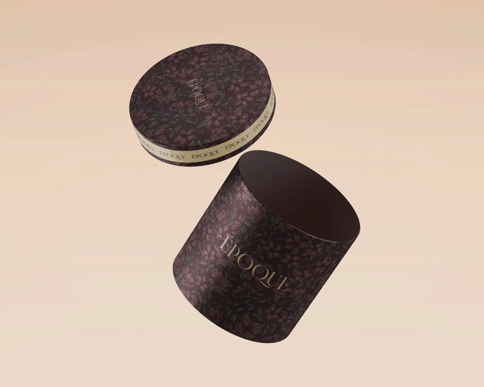
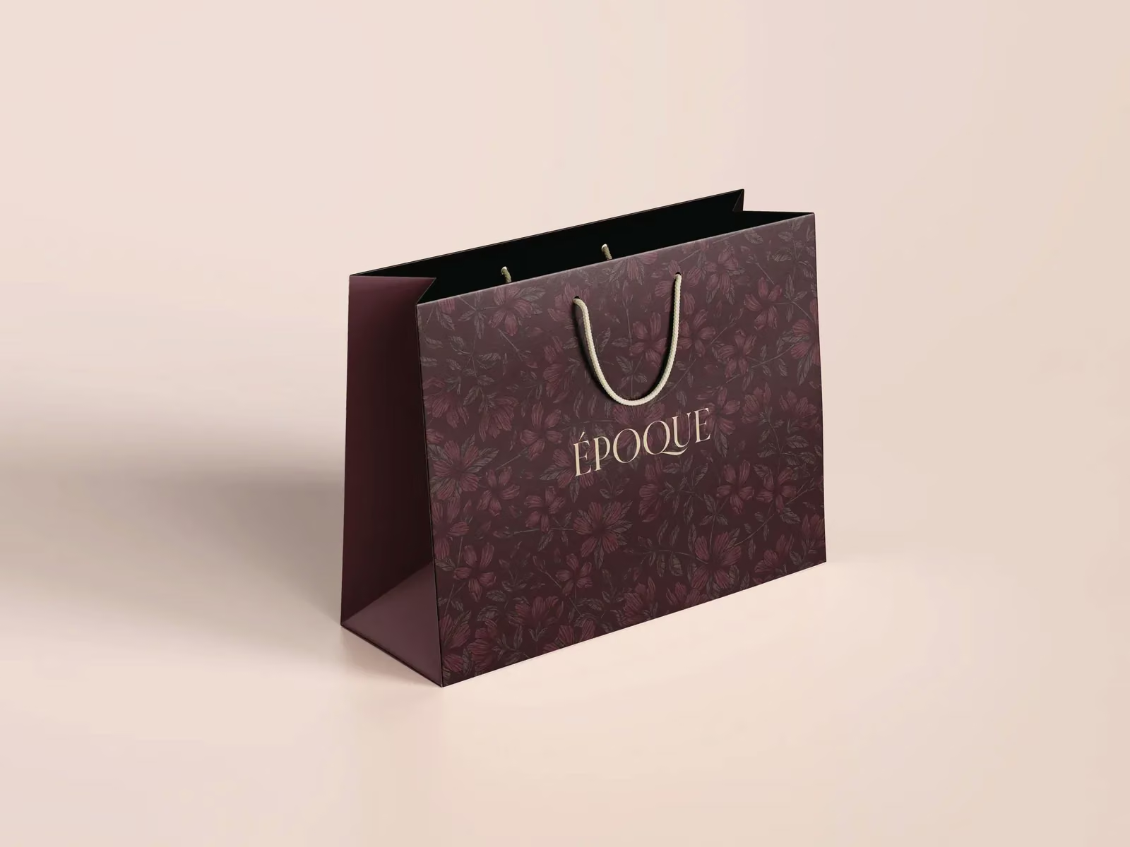
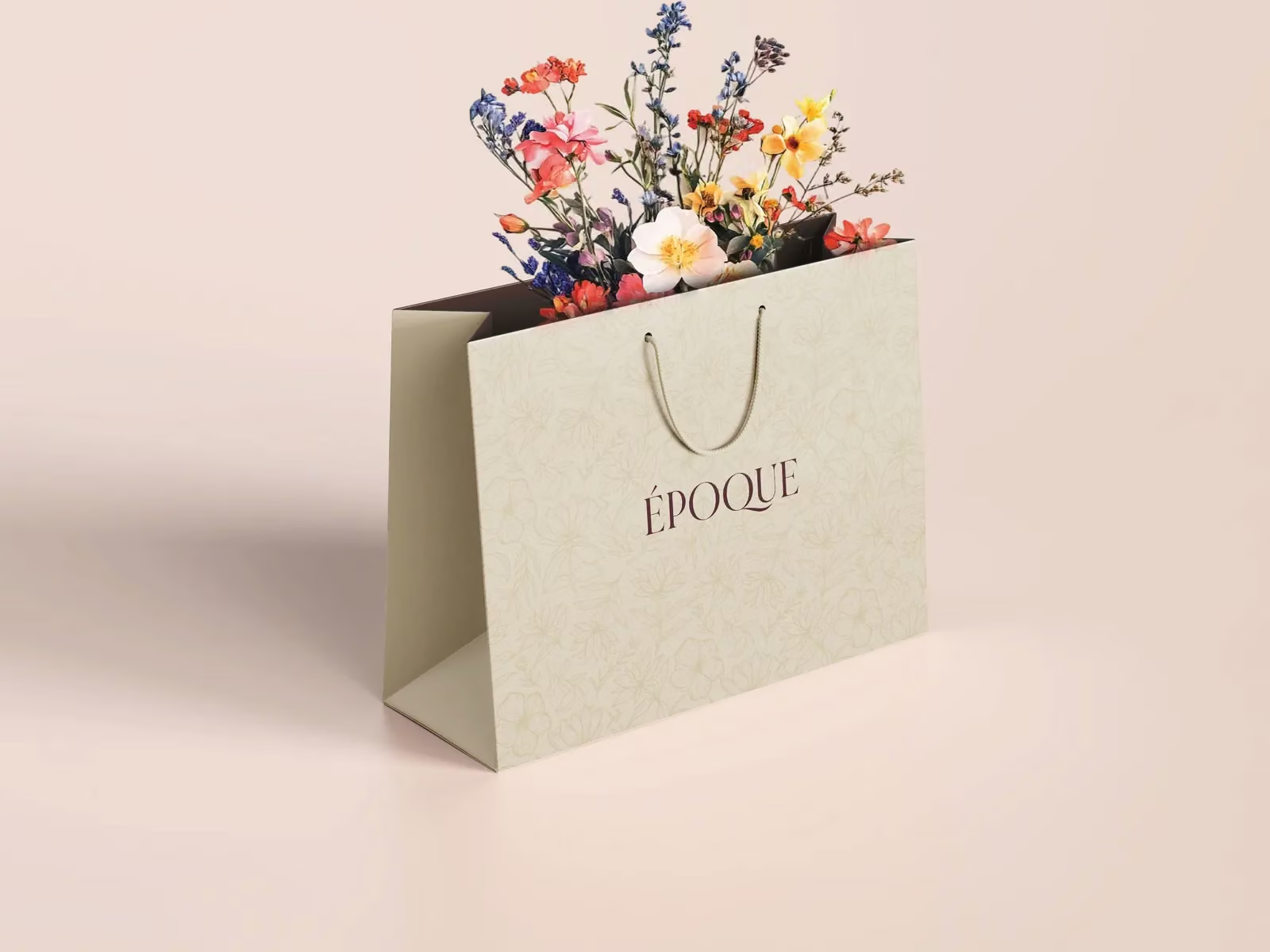
Cylindrical boxes, shopping bags, and bouquet wraps extend the identity into the act of giving. These application studies explore how the signature and botanical patterns work at different scales.
Gift boxes
Shopping bags
Wrapping paper
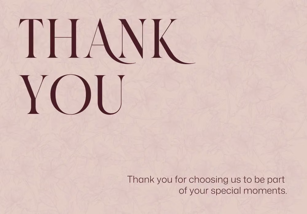
Seals & correspondence
Beyond the bouquet.
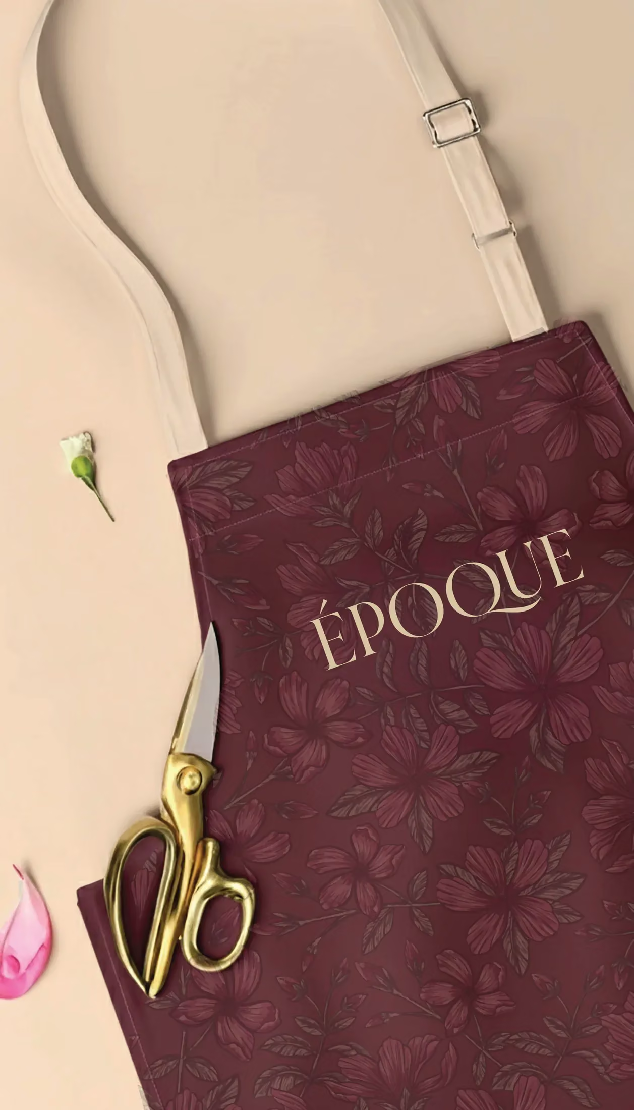
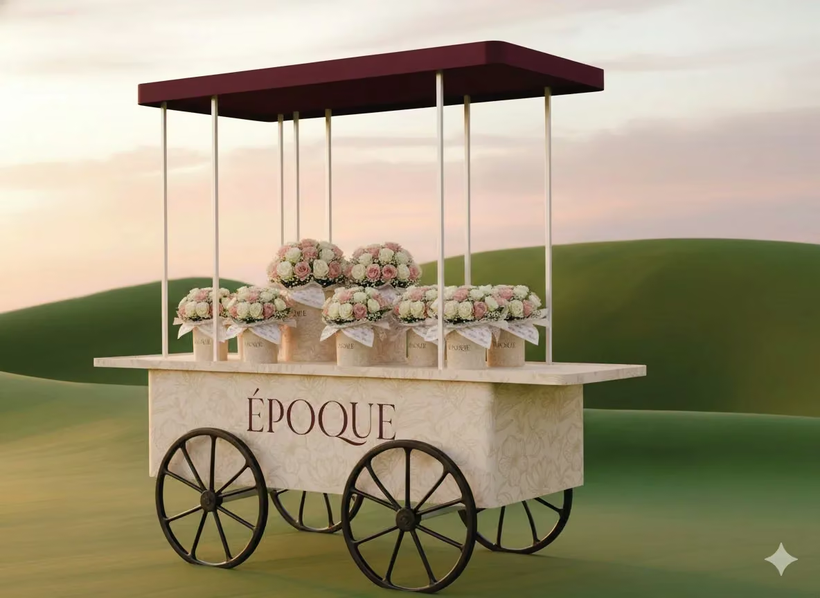
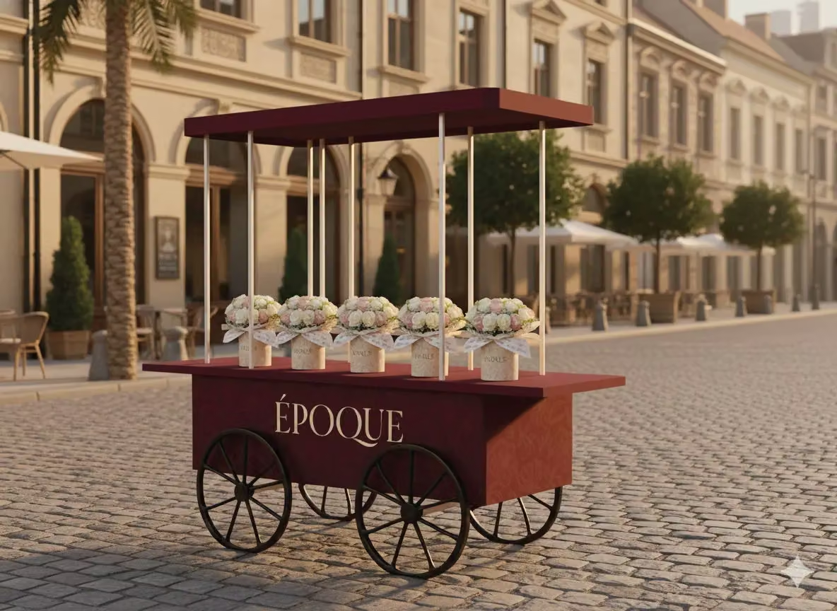
The system continues into the service experience, with uniform and floral-cart concepts carrying the same palette, wordmark, and attention to detail.
Époque
An era of elegance.
One visual language, from the first impression to the final detail.
Explore more projects