15 Art Direction Moves That Give an Image a Point of View
A practical visual guide to framing, texture, colour and constructed worlds—and how to make each choice serve the idea.
A photograph can be technically polished and still have very little to say. Art direction gives its choices a purpose: what belongs in the frame, what feels unexpected, and what the viewer remembers. When a concept feels flat, changing one visual rule can open a more interesting direction.
This guide adapts and expands the techniques collected by Zoë Yasemin in “Simple Art Direction Techniques To Elevate Your Concept” (7 March 2025). The reference images below illustrate other creatives’ work; the gallery credits follow her original selection.
Start with the feeling the brief needs, then choose a technique that supports it. Test one main move before stacking several together. A repeatable relationship between framing, light and styling will usually build a stronger campaign than fifteen unrelated effects.
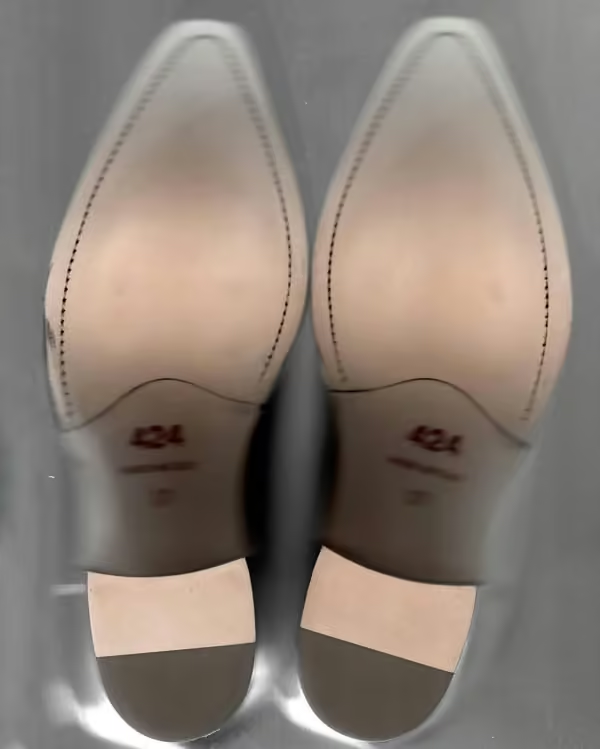
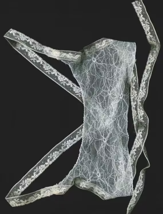
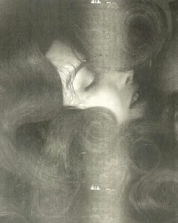
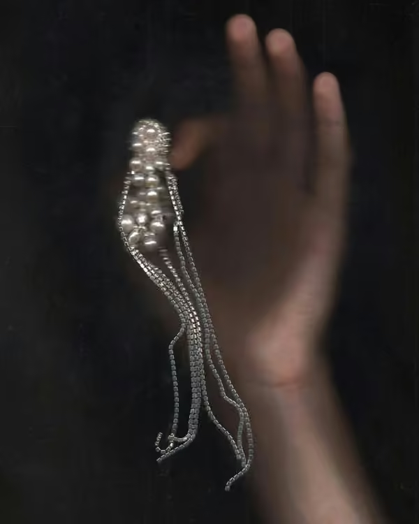
01 / Let the scanner become the camera
A scanner turns objects into surfaces: compressed depth, precise texture and unfamiliar shadows. Use that closeness for packaging, accessories or printed matter. Try arranging three objects with one repeated shape, then leave enough empty space for the composition to breathe.

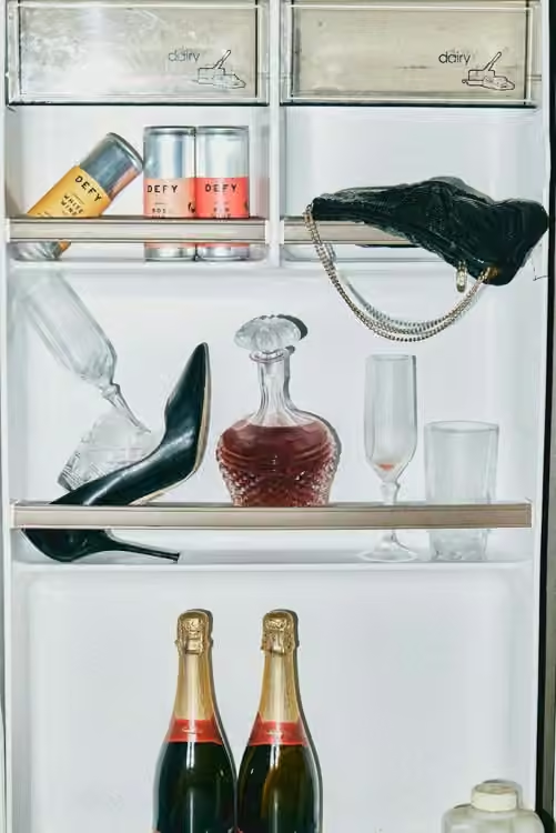
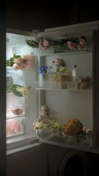
02 / Put the product somewhere it should not be
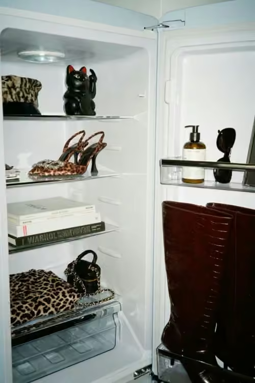
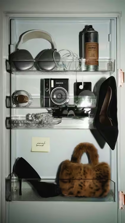
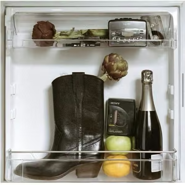
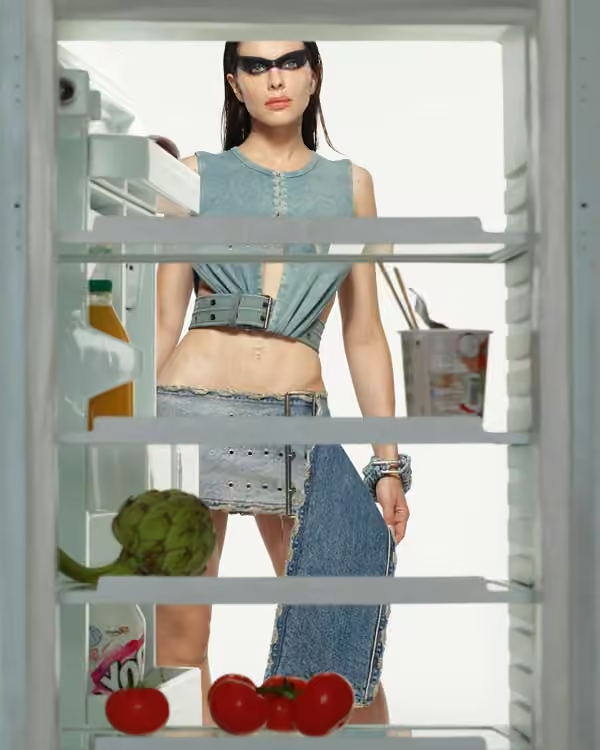
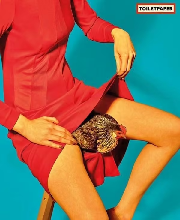
An ordinary fridge can make a luxury object feel oddly desirable. The contrast creates a question before the viewer reads any copy. Keep the surrounding details believable, and give the product a clear visual advantage through position, light or colour.
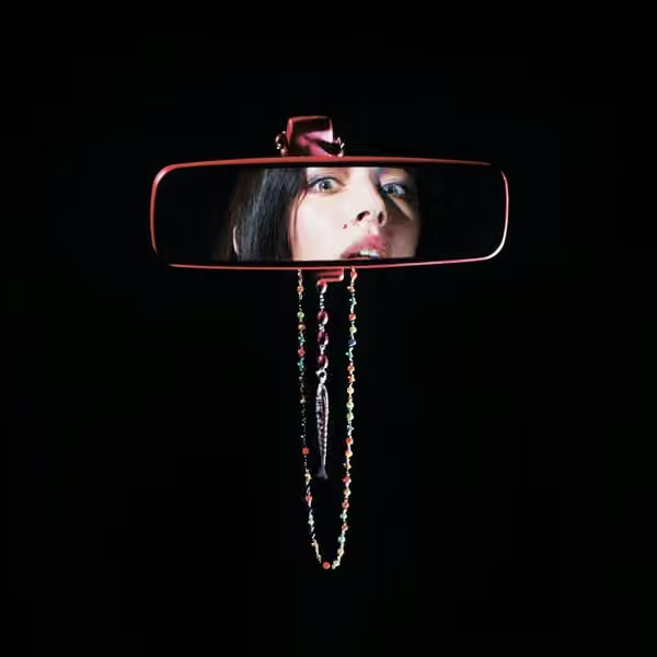
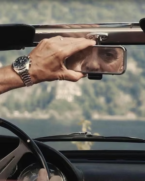
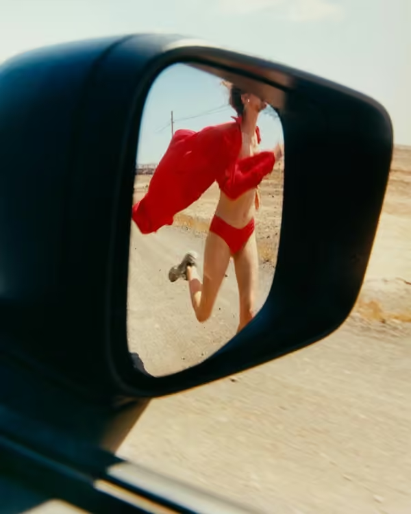
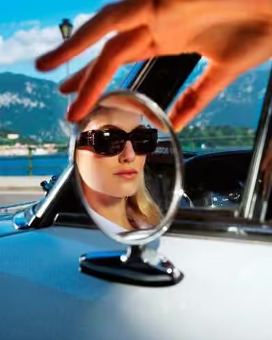
03 / Tell a story inside a mirror
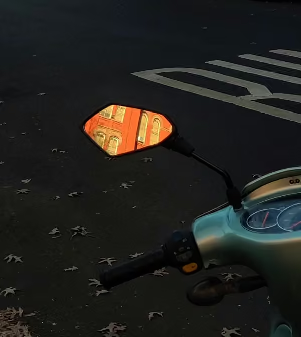
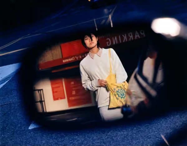
A vehicle mirror creates a second frame while its surroundings suggest a journey. It is useful for accessories and portraits with a sense of place. Check the reflection carefully: the background, camera angle and visible fragments should all support the same story.
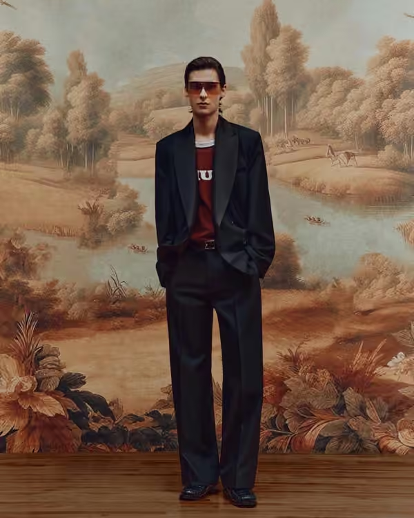
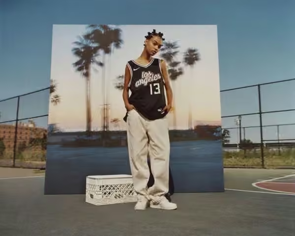
04 / Build a location with a printed image
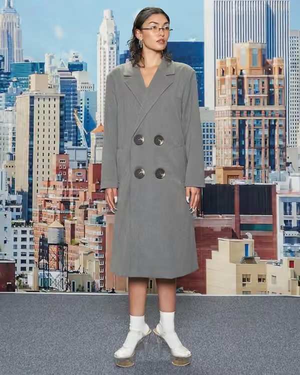
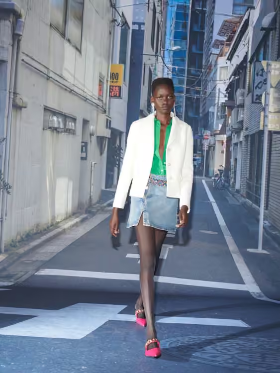
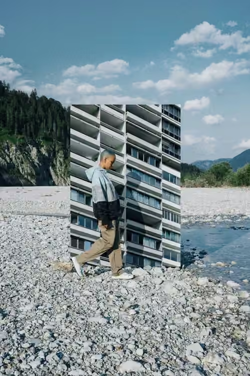
A printed landscape turns the studio into a deliberately constructed world. Decide whether the illusion should convince or reveal itself. Matching the light can make it plausible; leaving a slight mismatch can create a playful, theatrical image. Test both before committing.
05 / Filter the view through texture
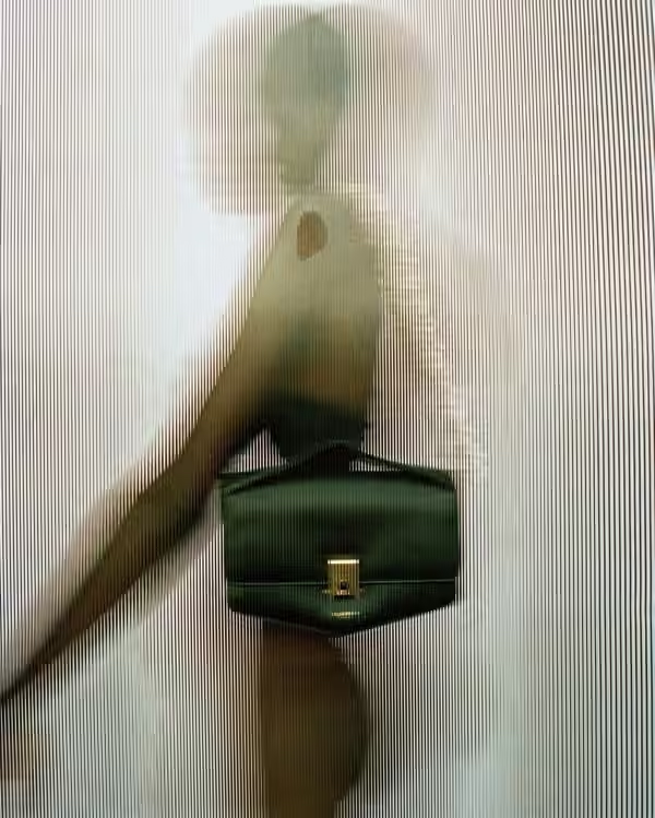
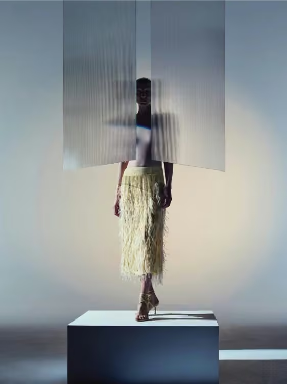
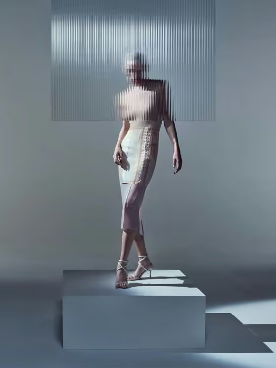
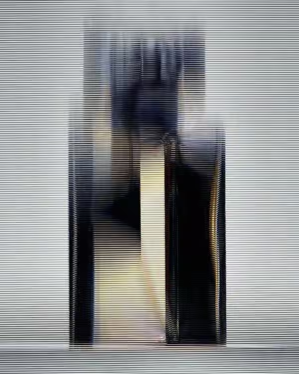
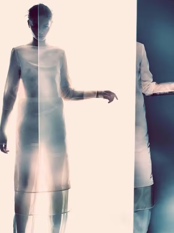
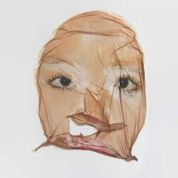
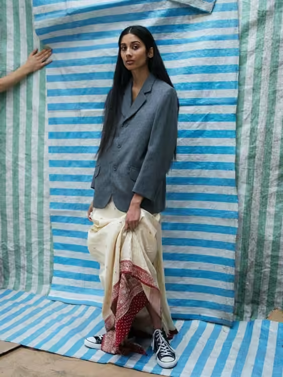
Textured translucent material between the camera and subject softens information without removing the silhouette. Backlight can make the surface part of the composition. Move the subject closer and farther from the panel to find a useful balance between recognition and mystery.
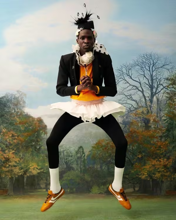
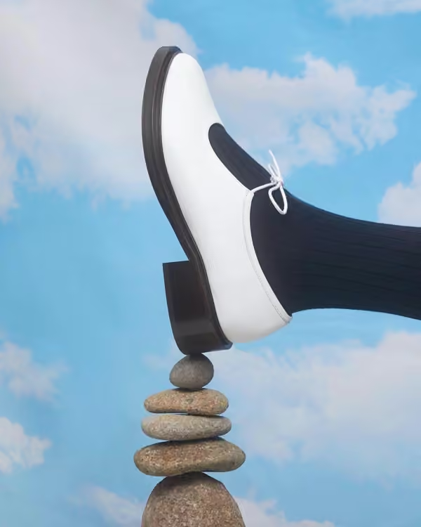
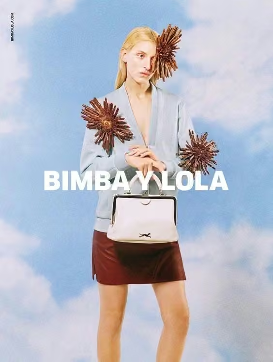
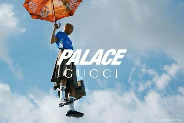
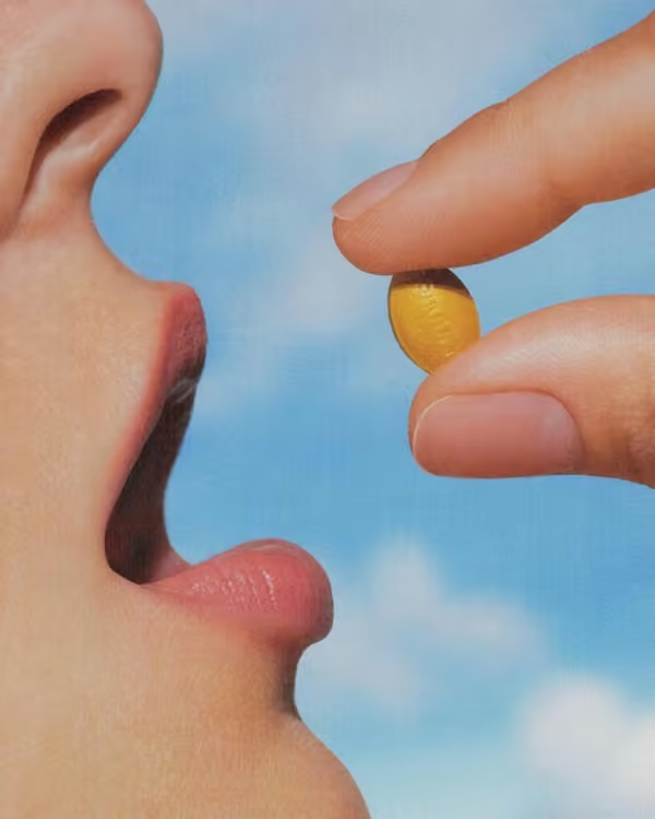
06 / Give the frame an open sky
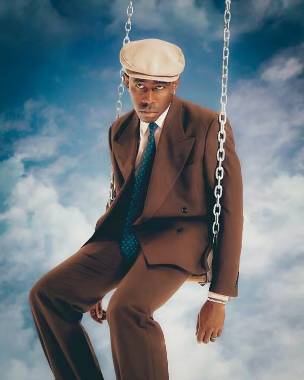
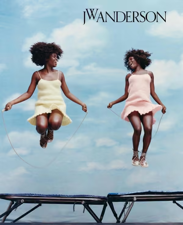
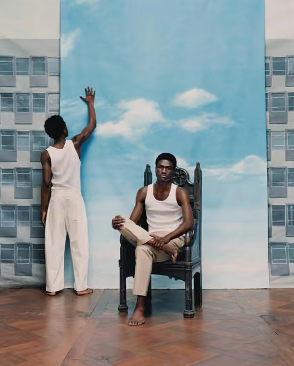
A blue sky gives dense styling or sculptural objects room to breathe. It can feel expansive, artificial or dreamlike depending on the horizon and lighting. Choose how much space the subject occupies, then use that proportion consistently across the series.
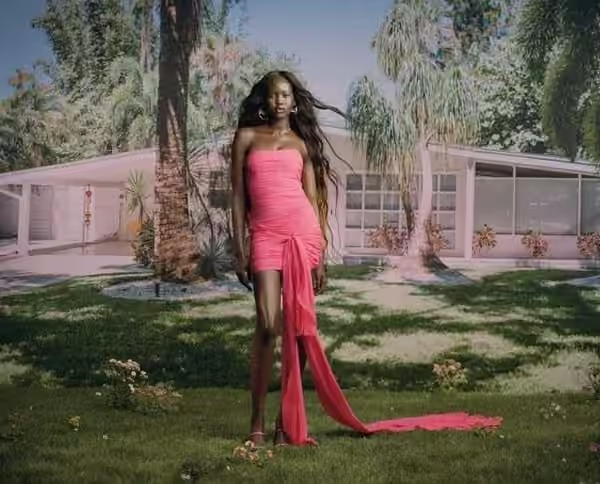
07 / Make colour carry the hierarchy
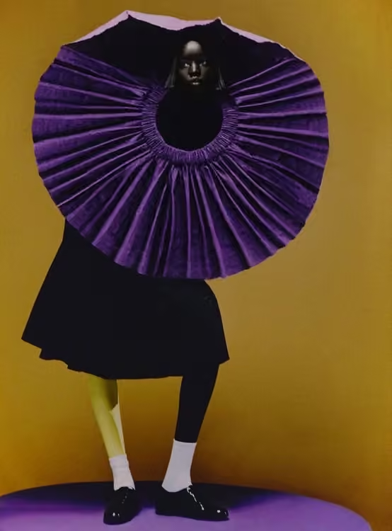
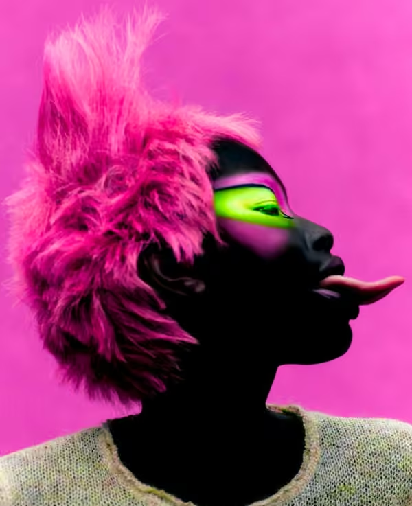
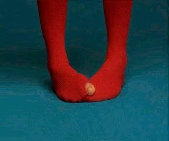
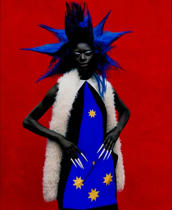
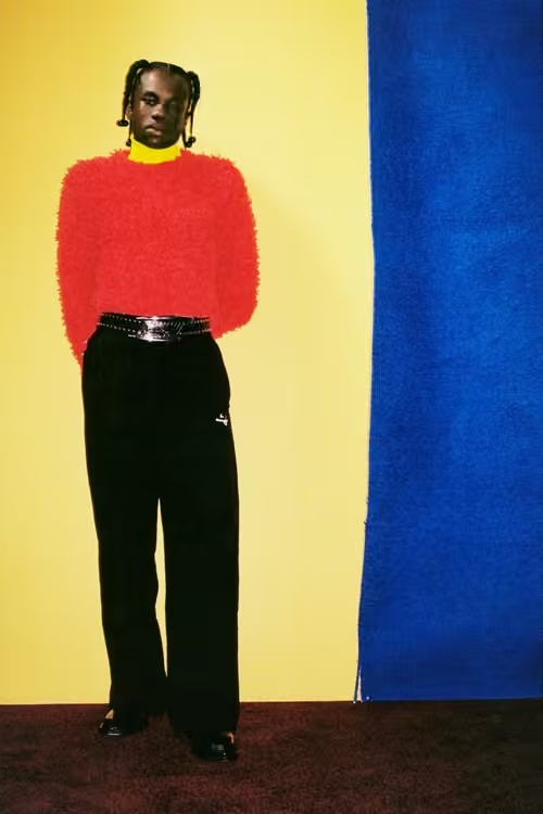
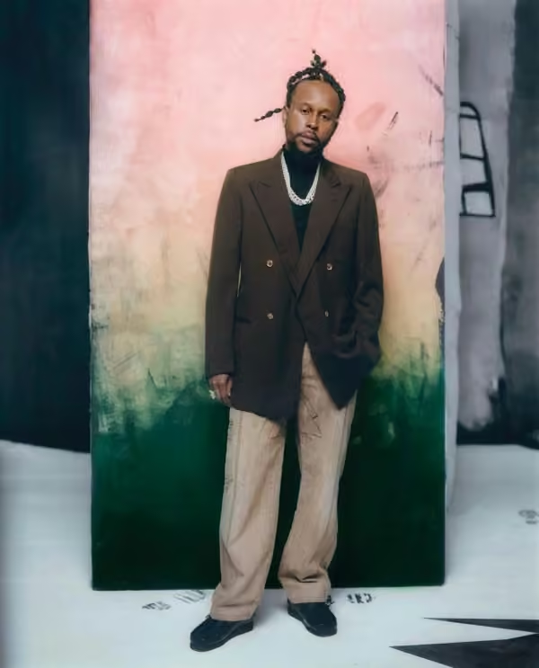
Colour blocking can make an image readable at thumbnail size. Choose a dominant field, a supporting colour and a deliberate point of contrast. Judge the balance before adding props: if every element competes at equal intensity, the product can disappear inside the palette.
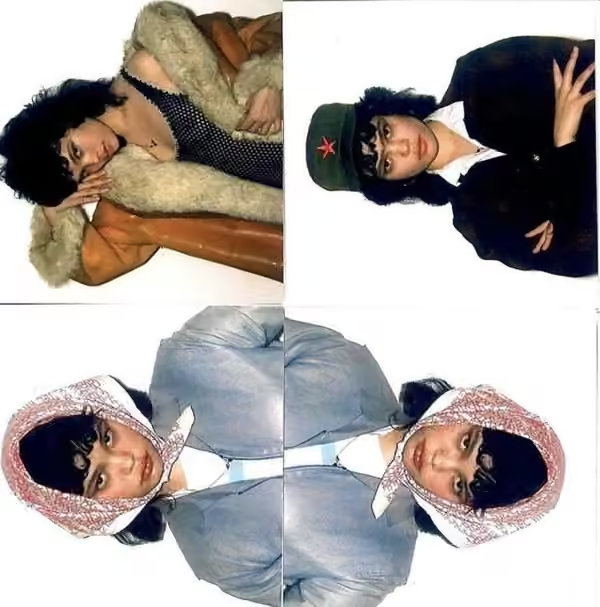
08 / Rebuild a portrait by hand
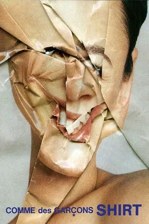
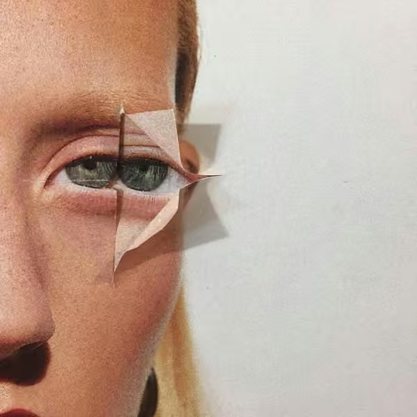
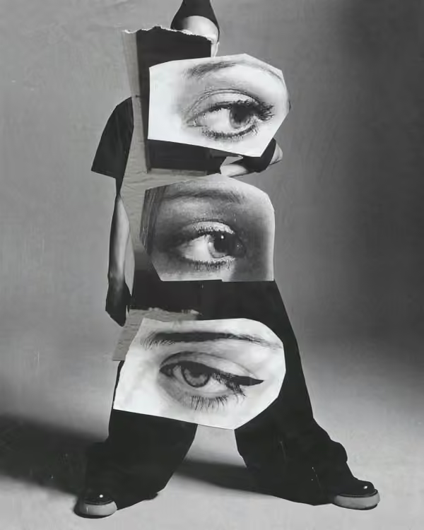
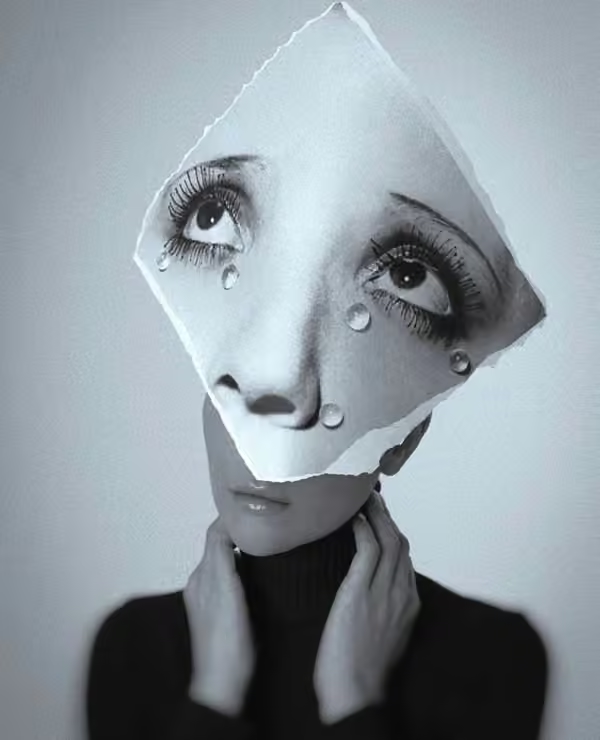
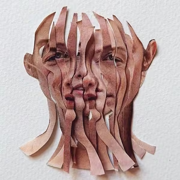
Print, cut, tear and reassemble. Physical collage introduces edges and shadows that polished retouching often removes. Let the intervention express something about the subject: repetition, fragmentation or interruption. Keep one recognisable anchor so the experiment still has a focal point.
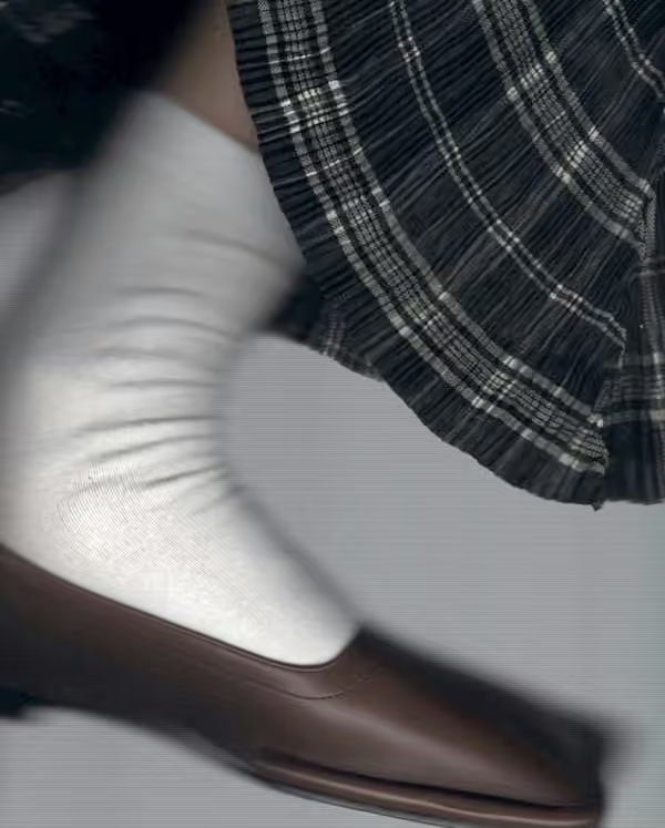
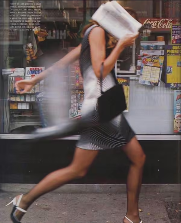
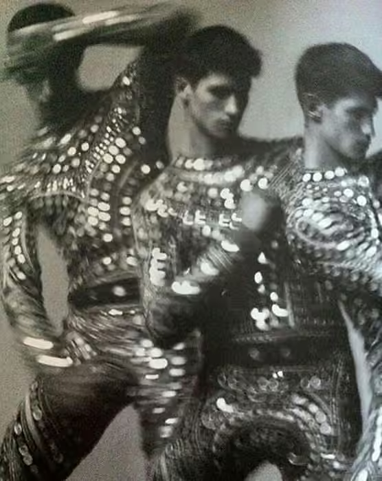
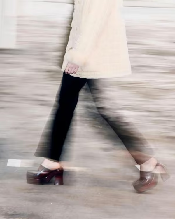
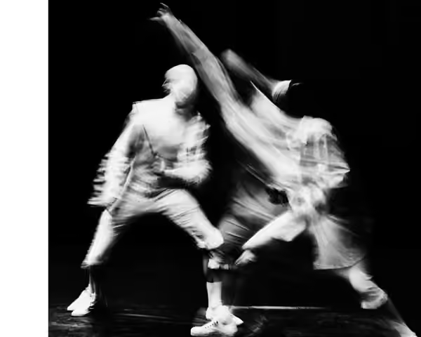
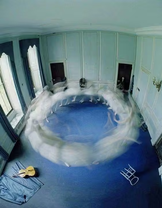
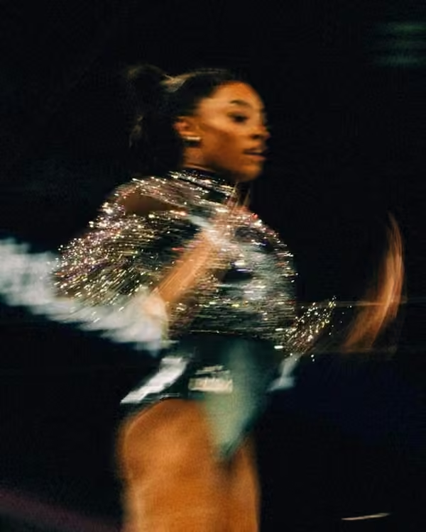
09 / Let movement leave a trace
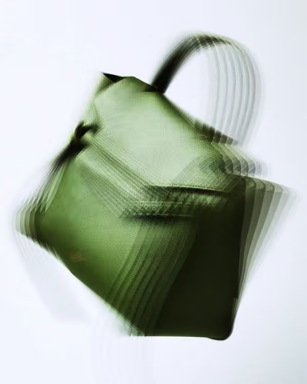
Motion blur gives a still image duration. Begin with one sharp anchor and let movement happen around it, or follow the subject to blur the surroundings. Test shutter speed against the actual action; the useful amount of blur is the one that preserves the intended reading.
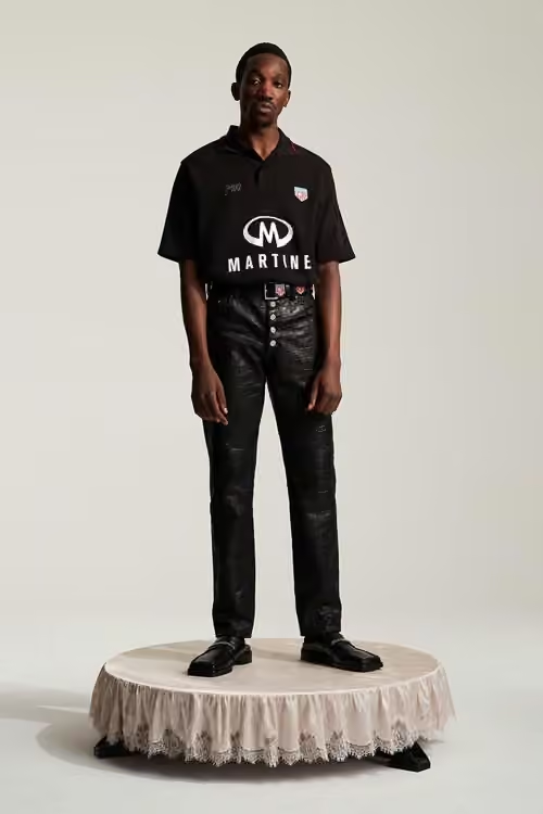
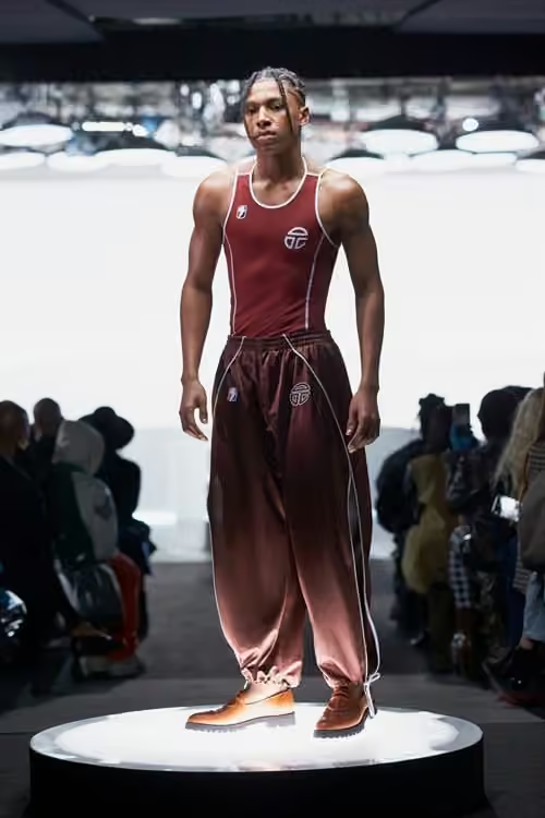
10 / Give the subject a stage
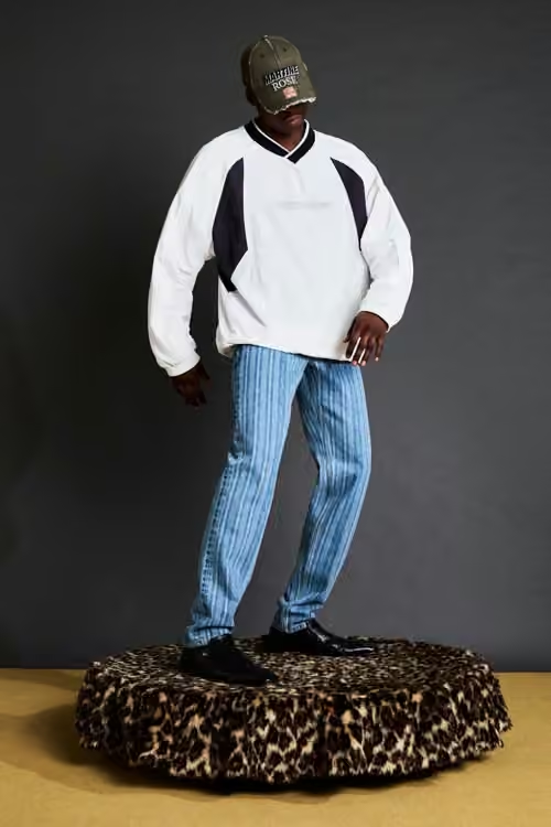
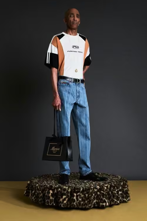
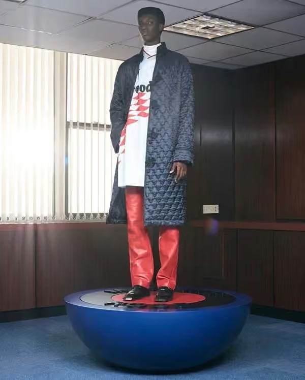
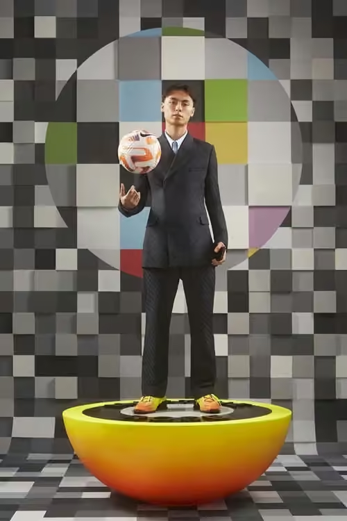
A platform separates the subject from ordinary space and turns the pose into a display. Its height, surface and proportions affect the attitude. Sketch the relationship between body, plinth and empty space before building; even a simple block can change the whole composition.
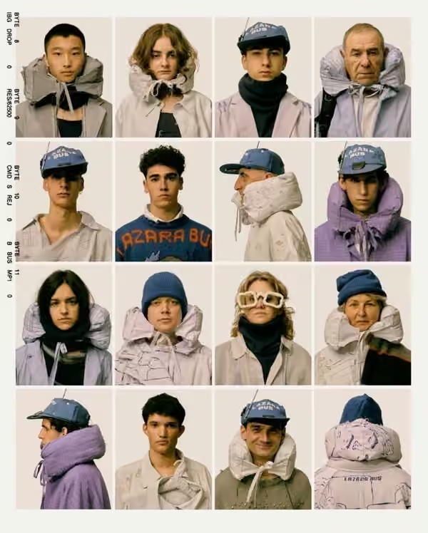
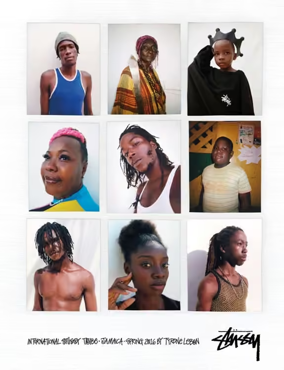
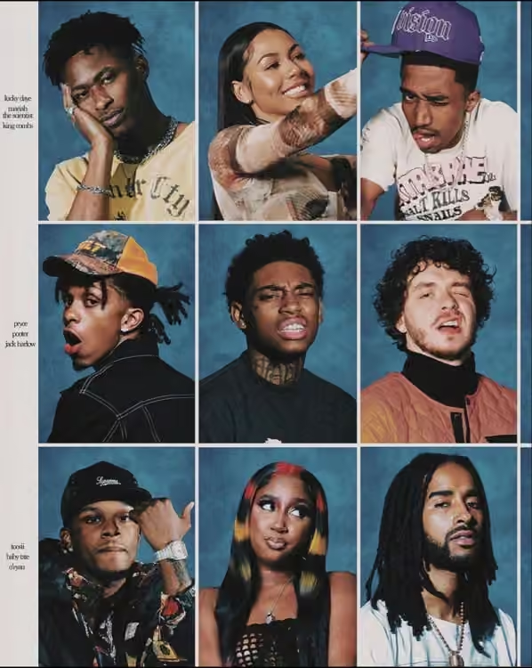
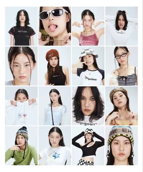
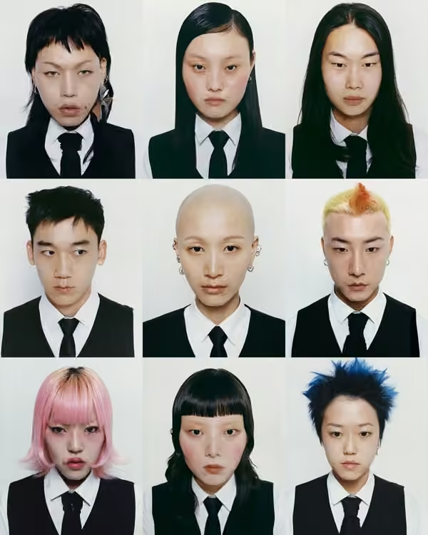
11 / Turn portraits into a system
A portrait grid lets difference become the story. Fix the crop, lighting or background, then allow expression and styling to vary. The repeated rule creates cohesion, while small deviations give the people character. Design the spacing as carefully as the individual images.
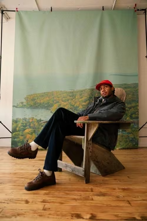
12 / Show where the set ends
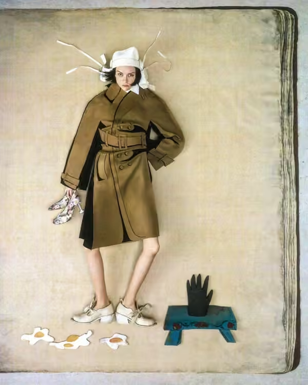
The edge of a backdrop can add a second layer to an image: the scene and the act of making it. Include only the equipment or studio details that contribute to that tension. A visible set still needs a controlled composition.
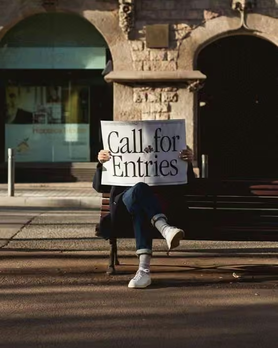
13 / Make typography a physical prop
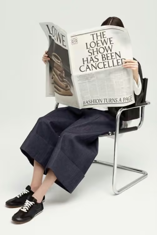
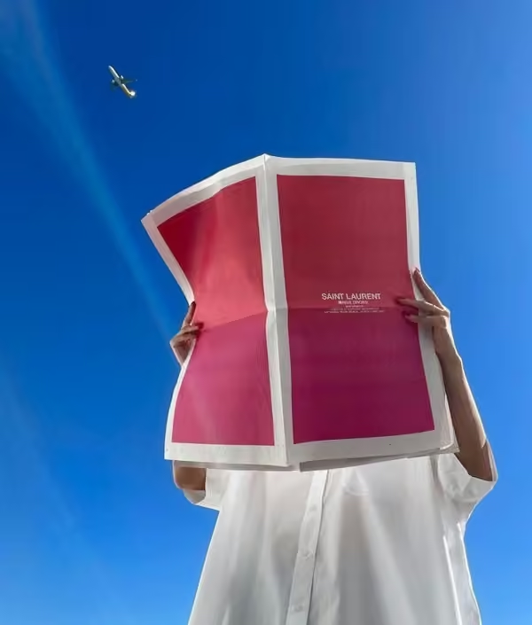
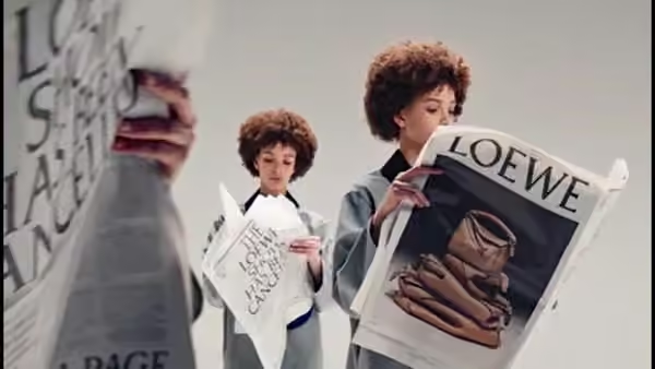
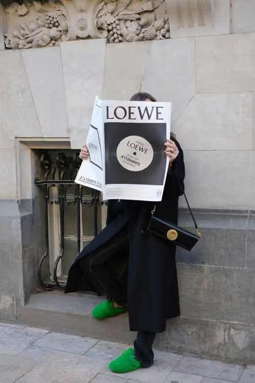
A newspaper carries copy into the photographed world. It can announce a collection, frame a portrait or introduce a narrative. Design the headline for the distance at which it will be seen, then test the folds and hand positions before the final shoot.

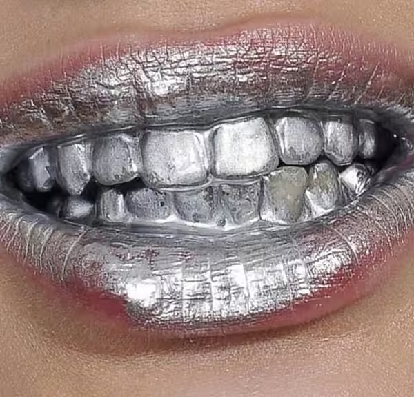
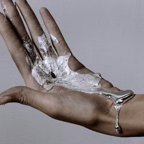
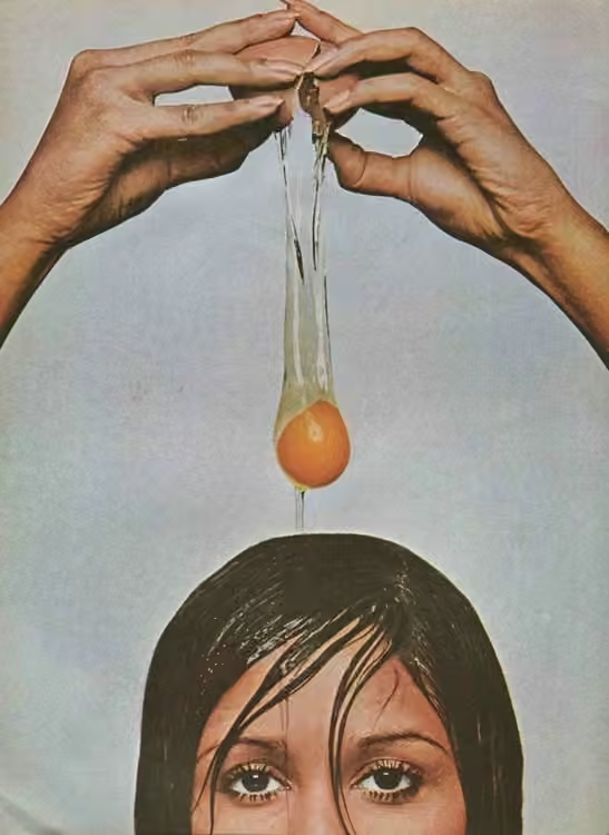
14 / Compose the spill
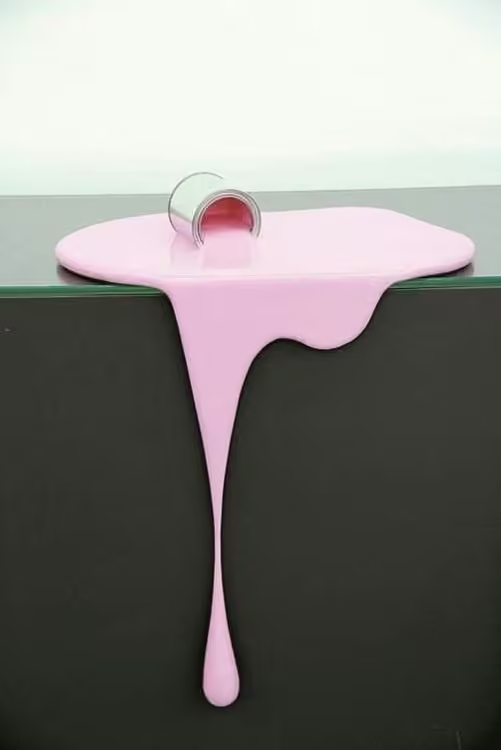
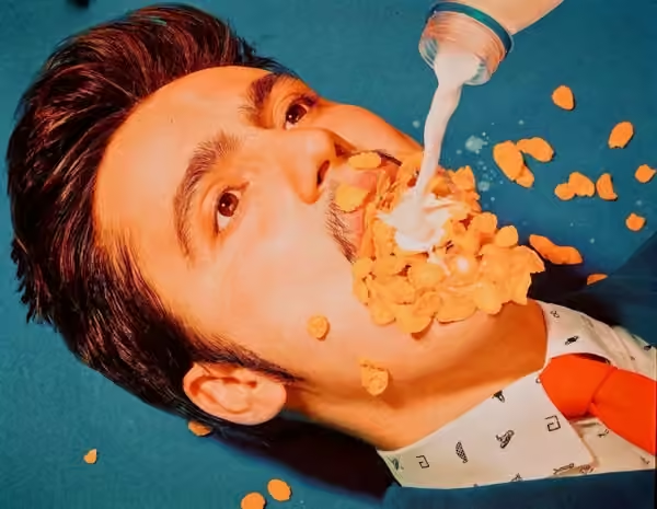
Drips, crumbs and melting surfaces make materials feel active. Decide where the mess leads the eye and where the product must remain clear. Build the composition first, then introduce the unstable element in small steps so the effect remains readable.

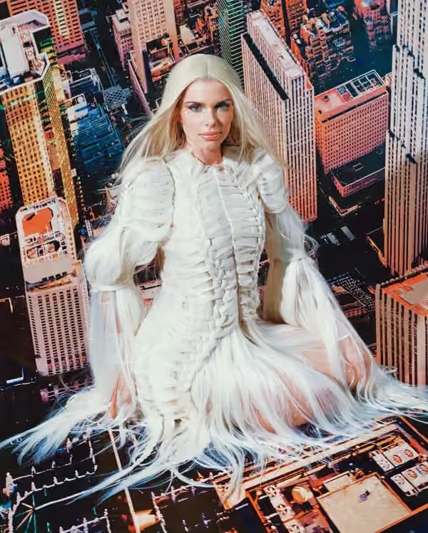
15 / Change the story by looking down
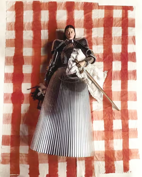
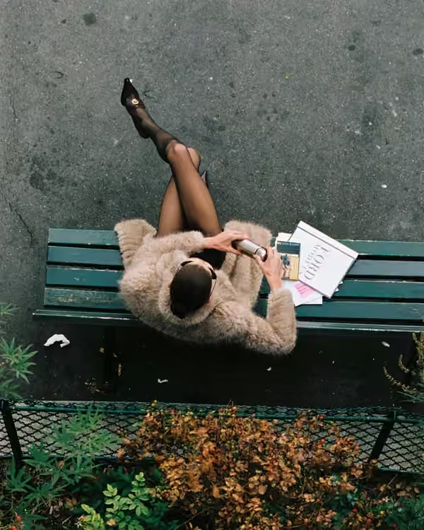
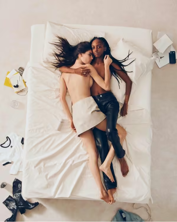
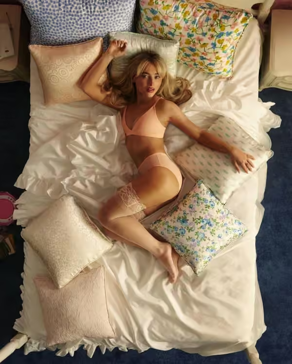
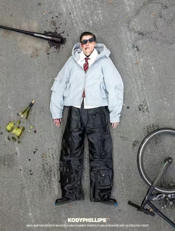
An overhead view turns bodies, clothes and objects into a shared graphic arrangement. Plan their spacing and direction as a single composition. Then leave one small sign of life—a displaced shoe, a turning head, an interrupted gesture—to keep the scene from feeling like an inventory.
Choose a rule. Make it mean something.
For your next brief, write the intended feeling in one sentence. Select two techniques, make a quick test of each, and compare what the viewer notices first. Keep the one that strengthens the idea. Repeat its key decisions across the campaign, while giving each image a reason to exist.